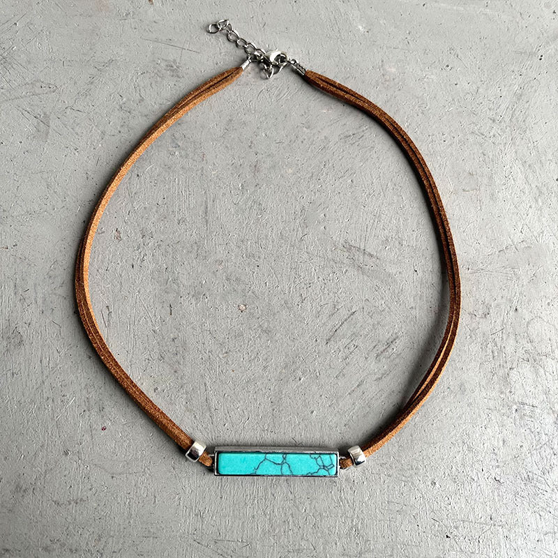
A denim jacket and a turquoise-colored necklace sound like an automatic Western-style pairing. In practice, the combination can feel crowded, disappear into the shirt, or look oddly disconnected even when every individual piece is attractive. The problem is usually not the color. It is the layout. A jacket creates lapels, seams, metal buttons, pockets, a collar, and a strong rectangular frame. A necklace has to occupy a useful part of that frame instead of competing with all of it.
This guide treats the outfit like a small design board. You will map the visible chest area, choose one focal route, test pendant placement, manage denim texture, and correct nine common styling errors. The goal is not to invent rules that every body or garment must follow. It is to give you repeatable tests that work in a mirror, in a phone photograph, and during real movement. Product names such as “turquoise” are used as shopping and color language here; confirm any material, measurement, finish, or care fact on the live listing before purchase.
The Thirty-Second Answer: Give the Necklace One Clear Territory
The easiest improvement is to give the necklace an uncluttered territory between the shirt neckline and the jacket’s lapels. Put on the complete outfit, close the jacket to the position you actually plan to wear, and look for the empty visual zone. The pendant should either sit deliberately inside that zone, bridge its lower edge, or fall clearly below it. A pendant hovering on a seam or half-hidden by a lapel usually reads as accidental.
Next, decide whether the necklace or the jacket hardware will lead. If the necklace leads, reduce nearby competition: open one more button, choose a calmer shirt, skip an additional large brooch, or keep other jewelry quieter. If the jacket leads, select a smaller or simpler necklace role. This is a hierarchy decision, not a prohibition against layering.
Readers building a broader wardrobe can use the Turquoise Jewelry Guides as a topic hub. For a purchasing-first process, also see How to Choose Turquoise Necklaces for a Denim Jacket Outfit. This article stays focused on diagnosing the finished look.
Draw a Jacket Map Before You Add Jewelry
A denim jacket is not a blank background. It already contains lines that direct the eye. The collar points diagonally. The placket creates a vertical center. Chest pockets create horizontal blocks. Contrast stitching may outline each panel, and silver-tone or brass-tone buttons add repeated bright circles. Your first styling task is to notice those lines.
Mark four zones
- Face zone: the area from the jaw to the collar. Earrings, hair, scarf edges, and the upper chain all affect it.
- Lapel corridor: the V or narrow opening formed by the jacket fronts. A pendant can echo this corridor or interrupt it.
- Hardware band: the row of buttons, snaps, zippers, pins, and pocket fasteners. Too many reflective points can flatten the necklace into background noise.
- Shirt field: the visible fabric beneath the jacket. Its color and pattern determine whether the necklace gains separation.
Take a front-facing phone photo after marking the zones mentally. A photograph compresses the scene and makes competition easier to spot. Then take a three-quarter photo, because pendants can look centered from the front while catching on one lapel from an angle. Finally, walk ten steps and sit once. A layout that survives movement is more useful than one that works only when carefully arranged.
Mistake 1: Choosing Length Before Deciding How the Jacket Will Be Worn
People often evaluate a necklace against a T-shirt and add the jacket later. That reverses the useful order. An open jacket creates a broad frame. A partly buttoned jacket produces a narrow opening. A fully closed jacket may remove the shirt field entirely and place the necklace over denim. The same chain position can behave differently in each version.
Build a simple landing ladder. Tie a ribbon or spare cord at three approximate positions: high inside the collar area, mid-chest within the lapel corridor, and lower near or below the pocket line. Photograph each position with the actual jacket closure. Do not try to infer a product’s exact length from a model image. Use documented listing measurements, ask the seller when a necessary number is missing, and compare those measurements with your ribbon test.
A pendant that touches the jacket edge repeatedly may rotate, disappear, or become uncomfortable. A pendant positioned just above a seam can remain readable. Small changes matter because the garment has fixed construction lines. The lesson is not “long is better” or “short is better.” The lesson is to choose length after you know the jacket configuration.
Mistake 2: Letting the Pendant Fight the Lapel Shape
The open front of a denim jacket often forms a V. A teardrop or vertically oriented pendant can reinforce that direction, while a broad motif can intentionally stop it. Trouble begins when the pendant’s edge repeatedly lands on one side of the V. The eye sees an interrupted shape, and movement makes it worse.
Use a clearance test: place two fingers between the intended pendant boundary and the nearest lapel edge while standing still. This is not a universal fit measurement; it is a quick way to imagine a little movement space. If there is no clearance, try a different jacket opening, a calmer underlayer, or another landing zone. Recheck while seated because the jacket front rises and changes angle.
You can compare necklace silhouettes in the Western Necklaces collection. Shortlist by shape first, then open each product page for current options and documented details. Collection photography is useful for discovery, but the selected product listing should remain the factual source at checkout.
Mistake 3: Matching Every Color Instead of Building Contrast
A turquoise-colored pendant does not require turquoise boots, a turquoise belt, matching earrings, and a turquoise shirt print. Repeating the exact accent everywhere can scatter attention. A cleaner strategy is a contrast triangle: one main turquoise-colored focal point, one smaller echo elsewhere, and one neutral area that gives both room.
For example, let the necklace be the main point, repeat a small amount of the color in a ring or bag detail, and keep the shirt field solid cream, charcoal, black, or another chosen neutral. This is only a starting formula. A patterned shirt can also work when the pendant has enough quiet space around it. Test at arm’s length rather than judging from a close-up.
Denim wash changes the result. A dark indigo jacket often creates crisp separation from pale or bright details. A light, faded wash creates a softer field and may need a darker shirt to restore definition. Black denim can make silver-colored hardware and a cool-colored center appear more graphic. These are visual observations, not guarantees; lighting, finish, and camera exposure alter perceived color.
Mistake 4: Ignoring the Jacket’s Existing Hardware
Buttons, snaps, studs, rivets, zippers, pins, and contrast stitching already function like accessories. If each one is prominent, adding a detailed pendant, a large belt buckle, and multiple statement pieces can create a competition with no winner.
Do a hardware count in the mirror. Cover the belt buckle with one hand and remove any pins or scarf. If the necklace suddenly becomes readable, you have found the competing element. Add pieces back one at a time. This method is more reliable than assuming two metal colors cannot mix. Mixed tones can look intentional when one is dominant and the others repeat in smaller amounts.
When the necklace is the focus, let the jacket hardware behave like punctuation rather than a second headline. When the jacket has decorated shoulders or prominent studs, a quieter pendant role may give the entire outfit more confidence.
Product Layout Lab: A Teardrop Pendant Route
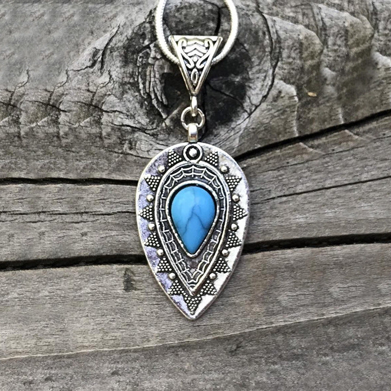
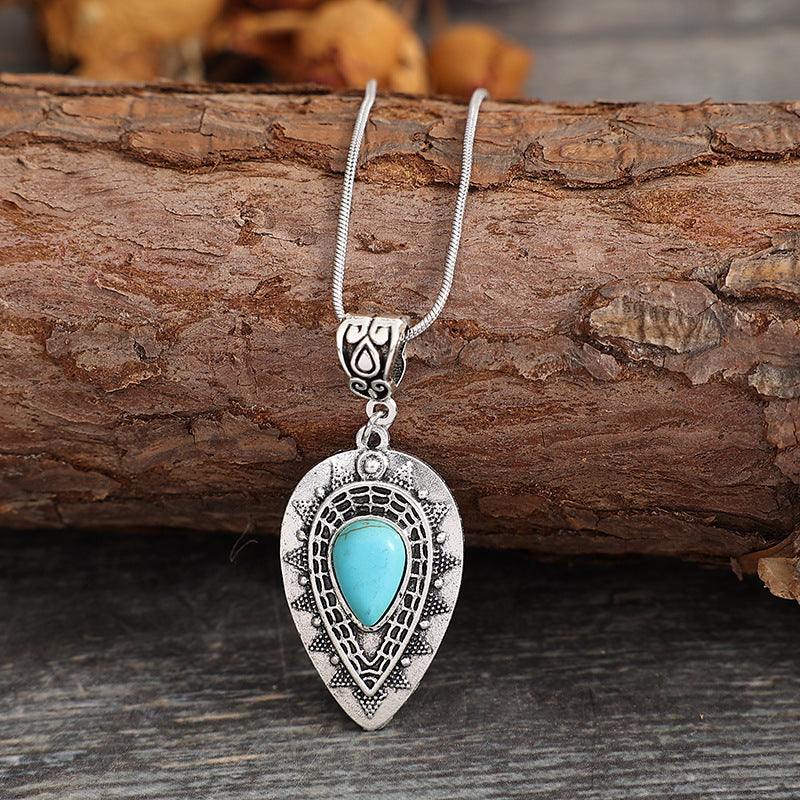
The Turquoise Western Teardrop Pendant Necklace provides a useful current example of a vertical silhouette. The live product photography shows a turquoise-colored center area, a teardrop outline, and an antique-silver-color surrounding design. Treat those as visible styling cues. Do not infer the stone composition, base metal, coating, dimensions, or skin compatibility from the photographs alone.
Casual formula
Try a mid-wash jacket, a plain dark crew-neck shirt, straight-leg jeans, and the pendant as the single chest-level focal point. Roll the sleeves once so the outfit has a relaxed rhythm, but keep the pocket area free of large pins. If the pendant disappears against the shirt, change the shirt value before adding more jewelry. Contrast is often a better fix than quantity.
Sharper formula
Use dark denim over a light, smooth underlayer and keep the jacket open enough to form a deliberate frame. A vertical pendant can extend that line toward the center. Choose either noticeable earrings or a strong belt buckle as the supporting detail, not both automatically. Take a seated photo to confirm that the necklace does not collide with the jacket edge.
Before ordering, record the selected option, current price, listed measurements, closure, care guidance, shipping estimate, and return terms. If the page does not state something that affects comfort or use, ask. A styling plan should be based on the item you can verify, not an imagined specification.
Mistake 5: Treating a Motif Necklace as a Background Detail
A recognizable cross or other bold motif behaves differently from a simple geometric drop. It carries a stronger outline and may attract attention before color does. Putting it beside a large graphic tee, embroidered jacket panel, scarf print, and heavy buckle can turn the upper outfit into several competing messages.
The solution is not to hide the motif. Give it a clear field. A solid shirt beneath an open jacket lets the silhouette read. If you prefer a printed shirt, position the pendant in an area with lower print density and check whether the chain crosses important lettering or imagery.
Product Layout Lab: A Cross-Motif Route
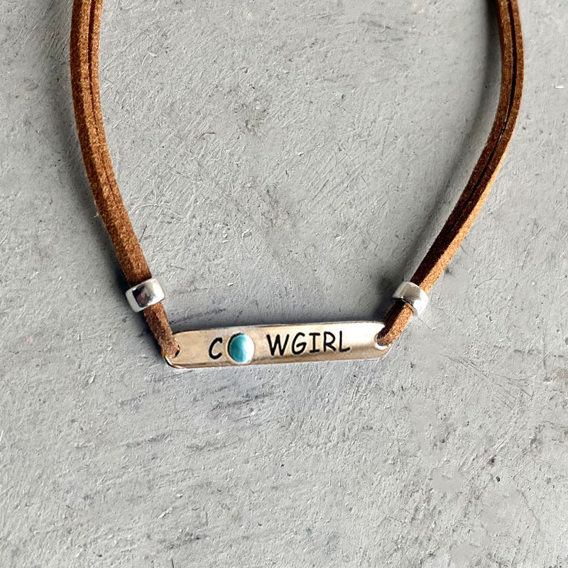
The Western Turquoise Vintage Geometric Cross Necklace is a current motif-led alternative. Its product gallery and design selector should be reviewed together because visible design options may differ. Confirm that the cart selection matches the exact gallery view you evaluated. The image establishes an appearance; it does not by itself document material identity, measurements, weight, durability, or care.
Weekend formula
Pair the motif with a faded denim jacket, a solid black or cream shirt, and minimal additional chest decoration. Keep the shirt neckline from cutting directly through the pendant’s lower edge. If you add a hat, check the full look in a photo; the hat brim adds another strong horizontal and may change the perceived balance.
Evening formula
Use black denim or a clean dark-indigo jacket with a smooth monochrome layer. Let the motif remain the upper-body focus and place any second strong detail farther away, such as footwear. The distance creates hierarchy. If a bright buckle is essential, compare photographs with the jacket slightly more closed and slightly more open. One configuration may separate the two focal points better.
For a wider mix of silhouettes, motifs, and accessory types, browse the Western Jewelry collection. Evaluate the final product page again immediately before checkout because options, availability, price, and store terms can change.
Mistake 6: Styling Only for a Front-Facing Mirror
A necklace can look perfectly placed while you stand still and fail during normal use. Jacket collars shift, shoulder bags drag one side, seat belts cross the chest, and seated posture shortens the visible area. A useful outfit test has four movements: raise both arms, put on the bag you will carry, sit and turn, then put on a coat if one is part of the day.
Notice whether the pendant flips, disappears under a lapel, catches near a zipper, or strikes hard hardware. Styling and comfort meet at this stage. If the necklace does not stay in the planned zone, change the landing position or garment configuration. Do not force the picture to work for five motionless minutes and assume it will work for five hours.
Mistake 7: Copying a Video Look Without Translating It
The video “Turquoise Necklaces” by John Hartman is paired with this topic as a visual reference. Watch it in full before relying on any specific statement. Creator lighting, camera distance, wardrobe, jewelry scale, and sales context may differ from your jacket and the two Oroxen examples above. Do not copy a transcript or treat a demonstration as product-page evidence.
Use a three-column note while watching: visible idea, works for my outfit, and needs verification. A visible styling relationship can inspire a mirror test. A claim about a material, origin, construction, treatment, care method, or value must be checked against an appropriate source and the exact listing. This translation step turns inspiration into a responsible decision.
Mistake 8: Adding More Jewelry to Fix Weak Placement
When a pendant feels lost, the instinct is often to add earrings, bracelets, rings, and a second necklace. More pieces rarely repair a pendant that is sitting in the wrong zone. Remove accessories and solve placement first. Change one variable at a time: jacket opening, shirt value, necklace landing, or hair position. Then restore supporting jewelry deliberately.
Use the squint test. Look at the outfit from several feet away and narrow your eyes slightly. The dominant shapes and contrasts remain while small detail disappears. If the necklace vanishes completely, it may need cleaner surrounding space. If the entire chest becomes one bright cluster, subtract a competing element. The result should have an obvious first reading and an interesting second reading.
For a broader explanation of motifs and style language, read What Is Western Jewelry? Motifs, Styles, Materials & How to Choose. For an evidence-focused turquoise shopping workflow, continue with How to Choose Western Turquoise Jewelry.
Mistake 9: Forgetting the Outfit’s Real Destination
A country concert, office-casual day, road trip, dinner, and outdoor market create different movement, weather, security, and comfort demands. The best composition in a bedroom mirror may not be the most useful choice for the event.
- Concert: test movement, bag straps, heat, and whether the pendant repeatedly contacts jacket hardware.
- Workday: test seated posture, desk contact, video-call framing, and layers added for commuting.
- Travel: favor an outfit you can remove, store, and reassemble without tangling or losing small parts.
- Dinner: check how the necklace sits while seated and whether the table-level view changes the balance.
- Outdoor event: account for wind, sunscreen, moisture, dust, and changing layers; follow item-specific care guidance.
Write the destination at the top of your outfit note. Every decision should serve it. A clear use case prevents styling from becoming decoration without function.
Frequently Asked Questions
Does a turquoise-colored necklace always work with blue denim?
No combination works automatically. Denim wash, shirt color, pendant outline, landing zone, jacket hardware, lighting, and personal preference all affect the result. Use contrast and movement tests with the actual garments.
Should the necklace sit inside or outside the jacket?
Either can work. Inside the lapel corridor can create a contained focal point. Over a closed jacket can look graphic but introduces more seams and hardware. Choose the route that gives the pendant stable clearance and readable contrast.
Can I mix a statement necklace with large earrings?
Yes, but check hierarchy. If both pieces compete near the face, calm the shirt, hair, or jacket hardware. Photograph the full outfit rather than evaluating each accessory separately.
How do I choose between a teardrop and a cross motif?
Compare the role. A teardrop offers a strong vertical outline; a cross is a recognizable motif with a different visual message. Test both at the same landing position, then verify the exact product option and listing facts.
What if the listing does not provide the measurement I need?
Ask the seller before ordering. Do not estimate an exact chain, pendant, or extension measurement from photography. Save the answer with your order record when fit depends on it.
Is matching metal color across every item required?
No. Mixed colors can appear intentional when one leads and another repeats in smaller amounts. Visual balance matters more than a blanket matching rule.
How can I tell whether the outfit is over-accessorized?
Remove one strong element and take another full-length photo. If the necklace becomes clearer and the outfit gains a first focal point, the removed item was probably competing. Repeat until the hierarchy feels deliberate.
Where should I go next?
Return to the Oroxen home page, compare current pieces in Western Necklaces, and use the denim-jacket necklace buying guide for fit and evidence questions.
Final Outfit Audit: Frame, Field, Focal Point, Function
Before leaving, say four words aloud. Frame: is the jacket opening deliberate? Field: does the shirt give the necklace enough separation? Focal point: does the eye know where to land first? Function: can the outfit survive the movements and conditions of the destination?
If one answer is weak, change the smallest relevant variable. Open or close the jacket one step, alter the shirt value, move the landing zone, or remove one competing detail. This makes denim-and-turquoise styling practical instead of mysterious. You are not chasing a universal formula; you are arranging a specific necklace, a specific jacket, and a real day into one coherent composition.